Overview
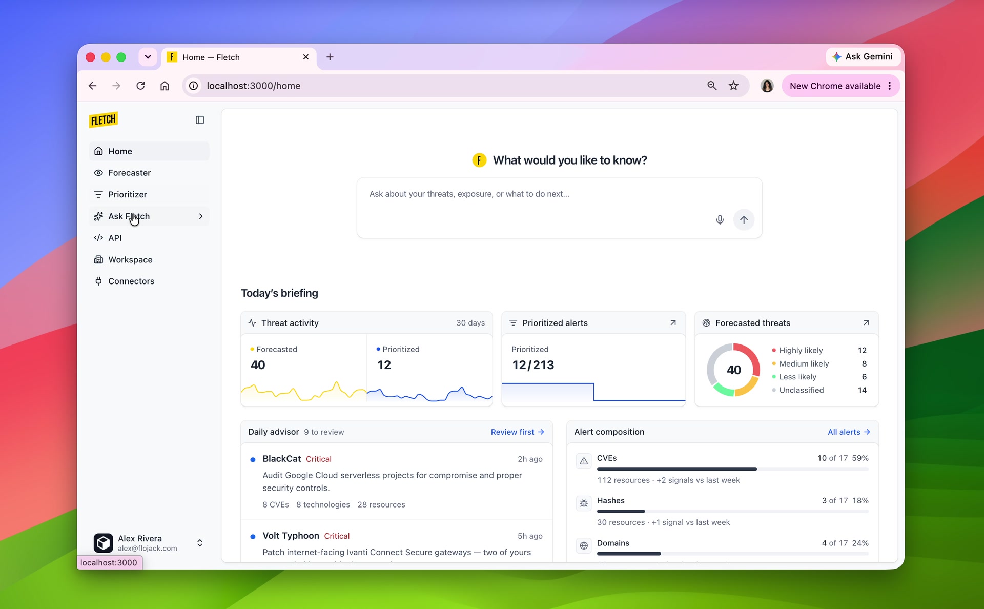
Fletch helps security teams anticipate threats and prioritize the ones their tools are already flagging. It combines organizational context, alerts, and threat intelligence, with Ask Fletch for deeper investigation. As the solo designer, I worked across onboarding, monitoring, and investigation.
- Role
- Product Designer
- Team
- Me, one PM, three engineers
- Timeline
- 2024–2025
- My contribution
- Solo designer leading the product redesign
Problem
Fletch had outgrown its original feed, but people still needed a tour to understand its tools. The challenge was helping teams recognize the product’s value, find a starting point, and understand why a threat mattered to them.
- Teams needed to understand the value before investing time in setup.
- Dense summaries obscured the main content and why threats were relevant.
- Questions like “Are we exposed to SafePay?” needed evidence and room for follow-ups.
Onboarding
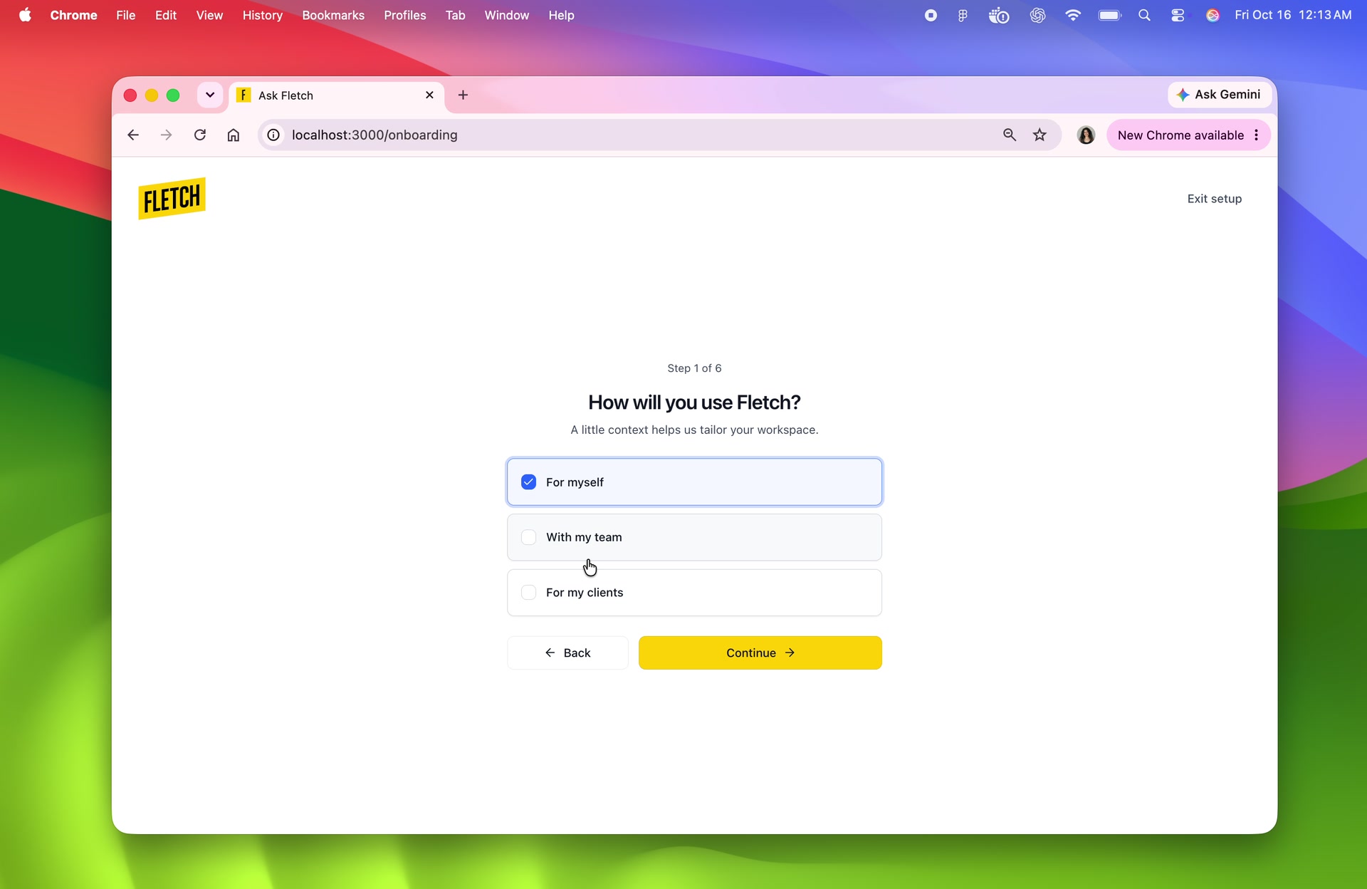
Onboarding establishes the organization’s context: its technologies, industry, and locations. That context gives Fletch a starting point for forecasting threats that could affect the team.
API setup
The API setup brings that same context into connected workflows. Teams can connect a data source, create a key, and use Fletch’s agents with responses tailored to their environment.
Home
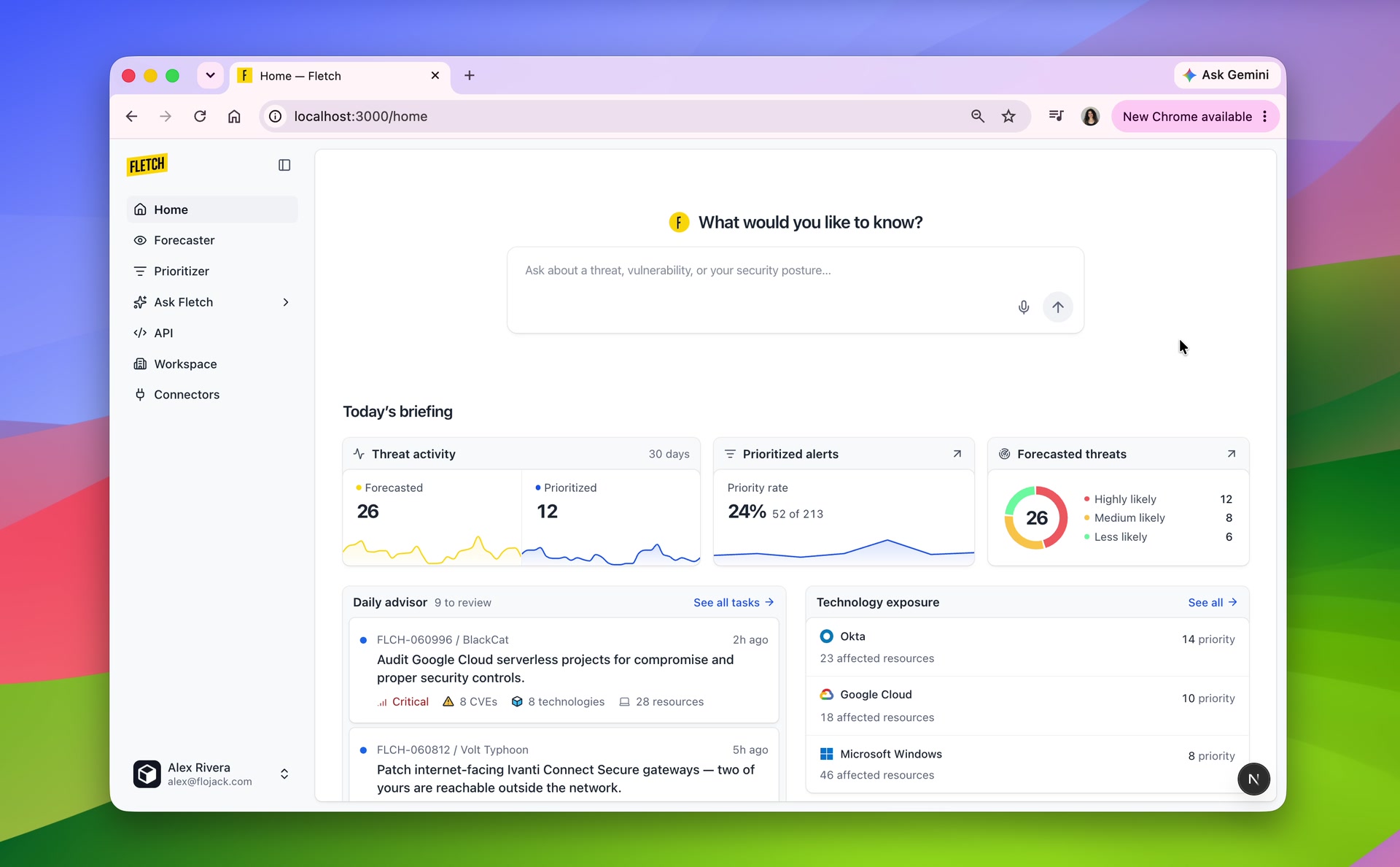
The home screen brings together the most important updates: a daily briefing, forecasted threats, and prioritized alerts. Teams can see where to focus and open a feed or investigation for more detail.
Forecaster & Prioritizer
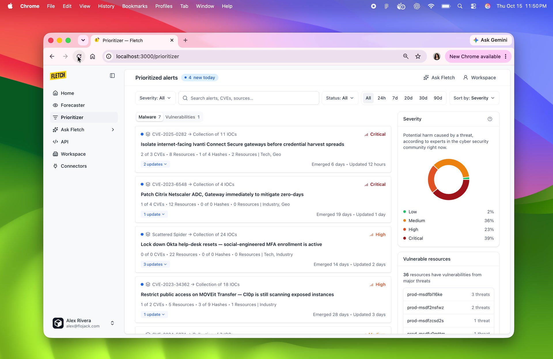
Fletch surfaces two kinds of threats: those that could be coming the team’s way, and those flagged by its alerting systems.
Forecasted threats and prioritized threats.
Organizational context
The technologies you use, your industry, and where you operate.
Forecaster
Infers threats that could affect your organization based on its context.
Alerts + threat intelligence
Alerts from your security systems, combined with threat intelligence.
Prioritizer
An AI pipeline prioritizes threats from your alerts to focus the team’s attention.
Forecaster
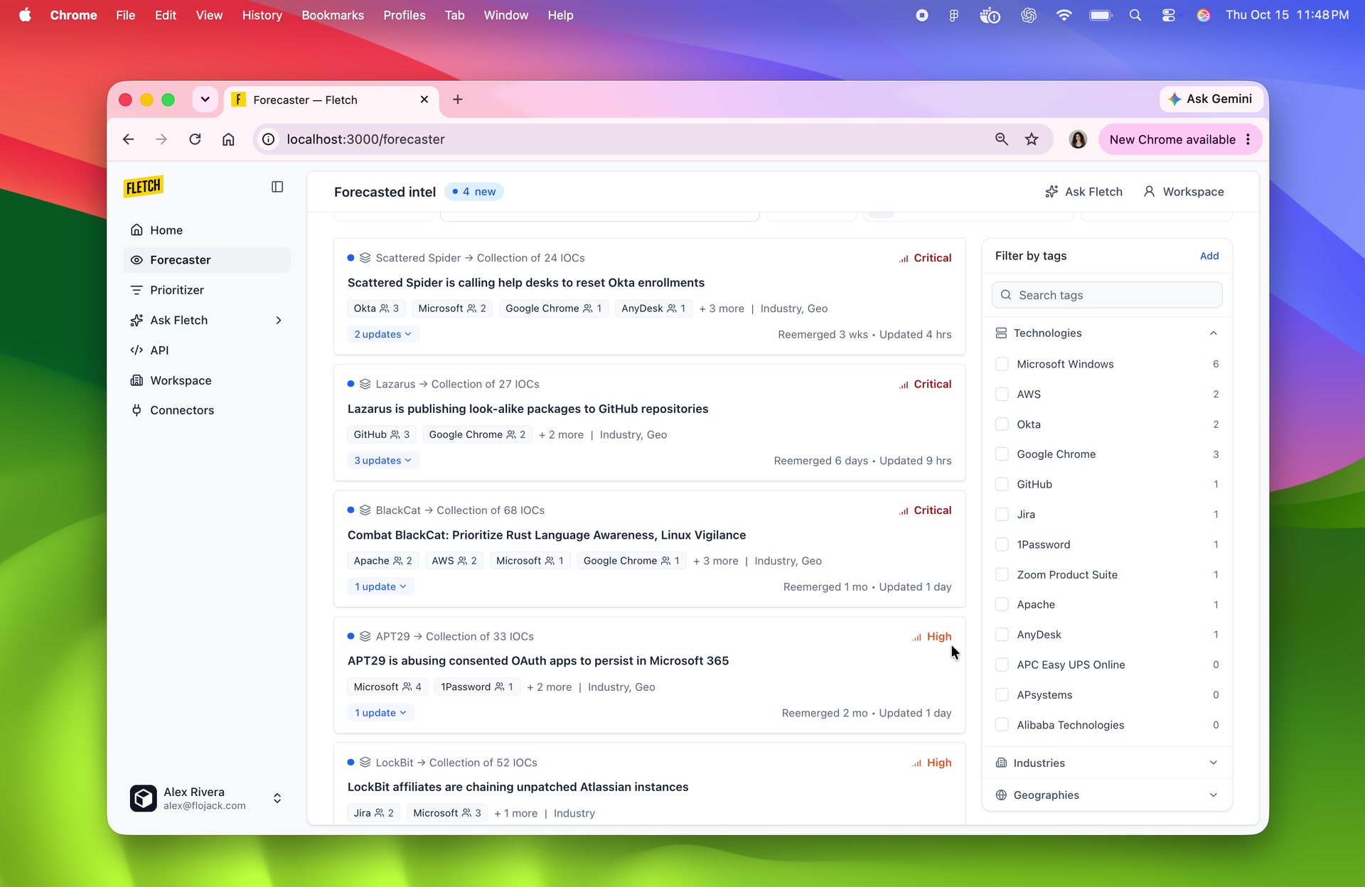
Forecaster uses the organization’s context to infer which threats could affect it. These forecasts give teams a view of what may be coming their way. Editable tags beside the feed let them adjust that context as their environment changes.
Prioritizer
Prioritizer combines alerts from the team’s security systems with threat intelligence through an AI pipeline. It prioritizes those threats, with severity and affected resources alongside them to support triage.
Threat boards
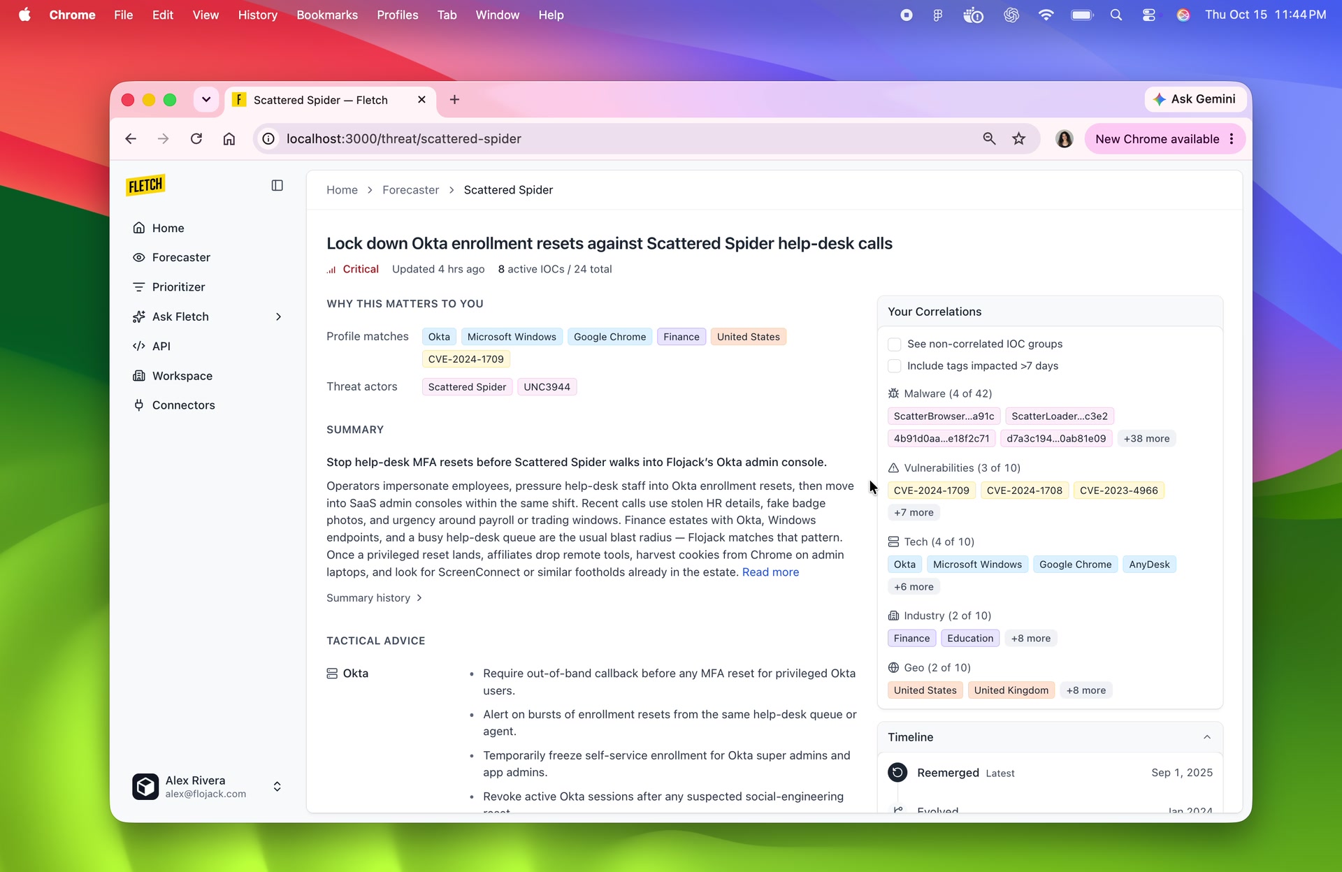
Threat boards bring relevance, evidence, and response guidance into one view, connecting a threat to the organization’s environment and next steps.
Explore an investigation
Follow a threat through its technologies, vulnerabilities, affected resources, and recommended tasks.
Ask Fletch
Ask Fletch lets teams investigate questions using the same organizational context. It automates research across published intelligence and connected endpoints, whether the question is about an industry or a specific threat.
Automating security research.
Read the threat profile
Start with the organization’s context to guide the research.
Search threat intelligence
Find published intelligence relevant to the question.
Check connected endpoints
Match the findings against the organization’s connected endpoints.
Bring the findings together
Generate an answer with citations and related threat boards.
Teams can follow the research as it happens, then check the answer against its sources. Citations and related threat boards keep the supporting evidence within reach.
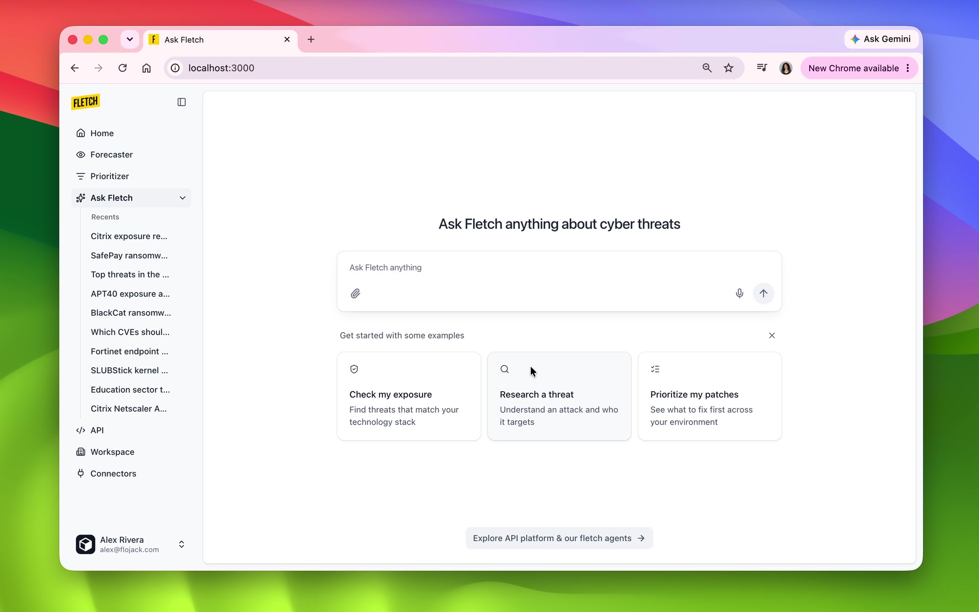
- Keep the answer readable
- Answers and follow-ups stay together, with citations attached to claims and supporting detail alongside.
- Make the evidence inspectable
- Sources and existing threat boards let teams verify claims without losing the conversation.
What changed
The product connects setup, monitoring, and investigation around the same organizational context. Teams can follow a forecast or prioritized threat into its evidence, then use Ask Fletch to investigate further.
- Anticipate
- Forecasts surface threats that could affect the organization.
- Prioritize
- The AI pipeline combines alerts with threat intelligence to identify what needs attention.
- Investigate
- Automated research brings together answers, sources, and follow-up questions.