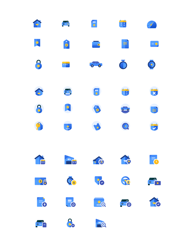
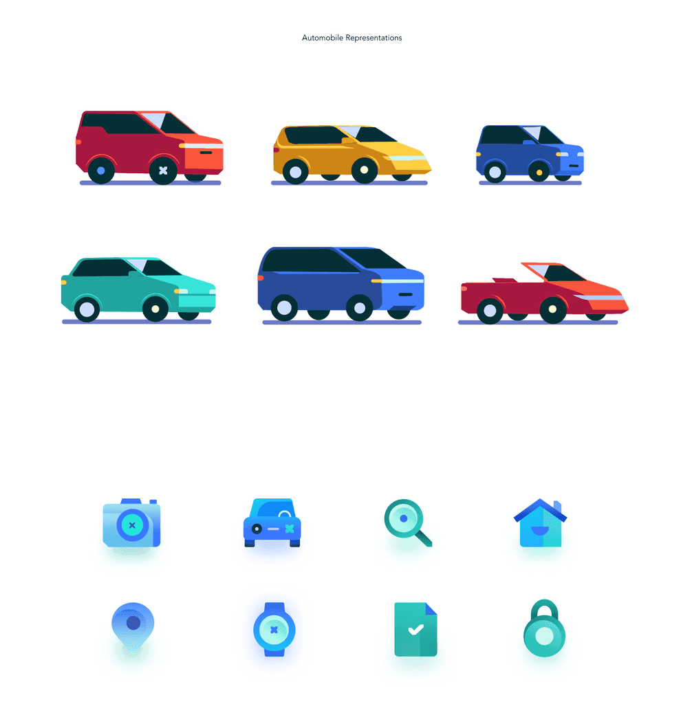
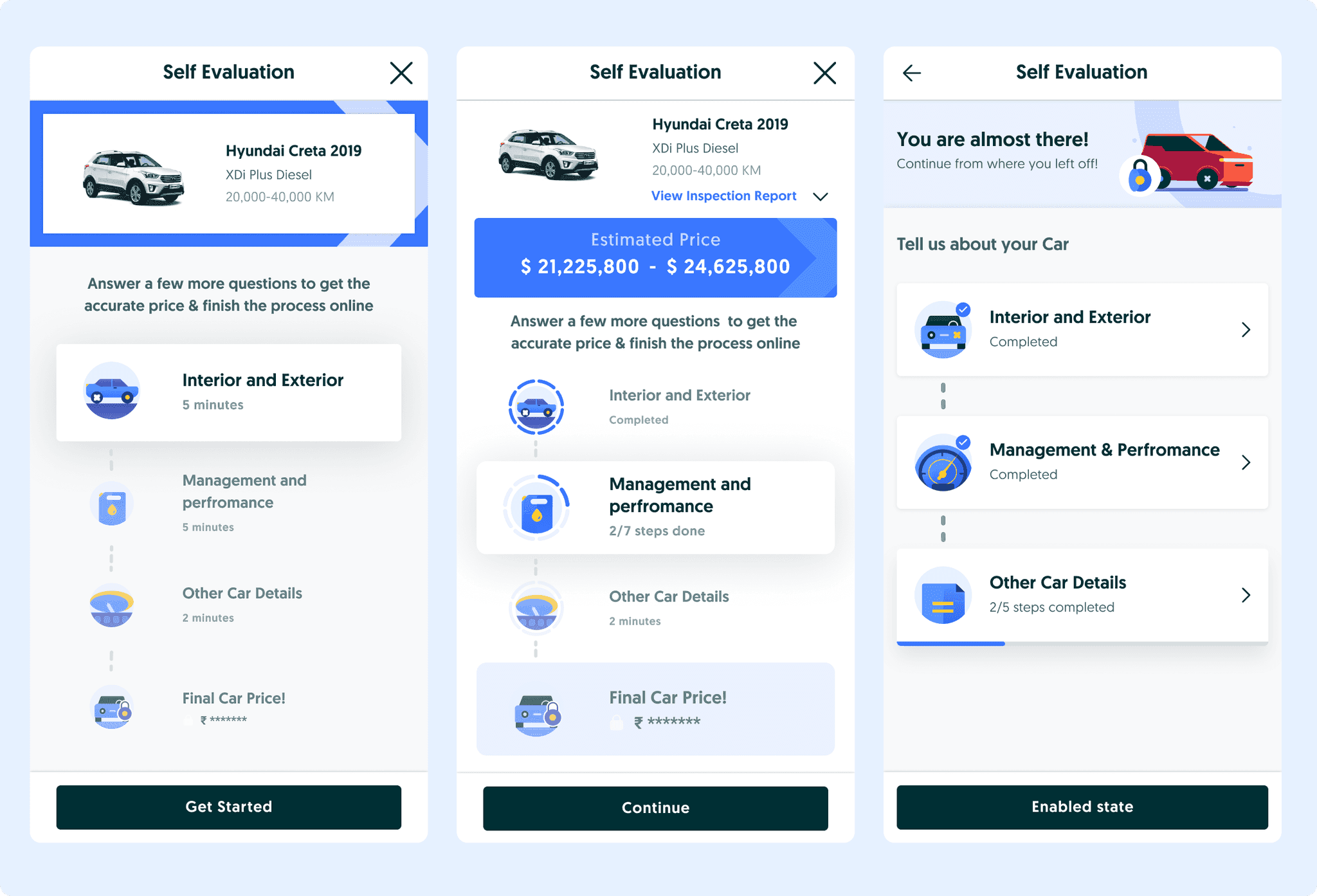
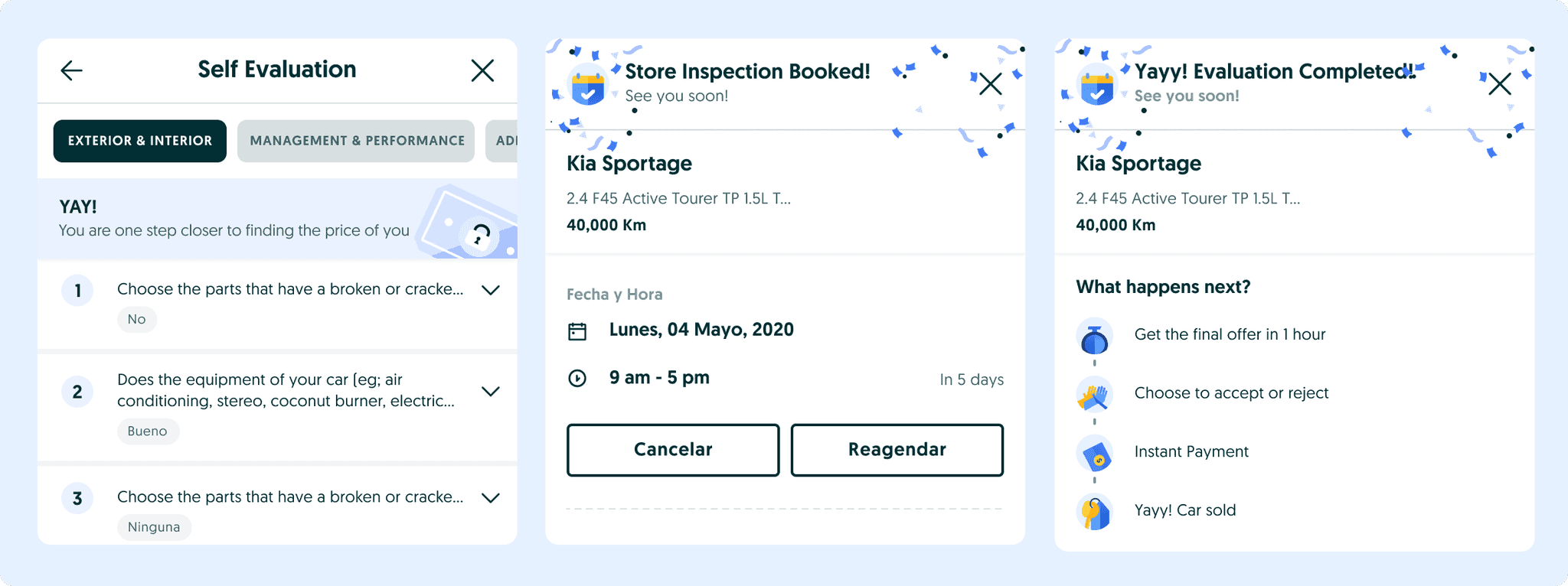
A slideshow of the icon system, illustration system, resumable self-evaluation, quote paths, and final booking and completion screens.
Overview
OLX Autos was launching the app in Mexico and Chile. Selling still lived on the web: long forms, a fuzzy quote, then a jump to inspection. The brief was to turn that into an end-to-end app journey and ship it on a new design system.
- Goal
- A seamless sell path on mobile that still gathers everything the business needs to price the car.
- Markets
- Mexico and Chile app launch, September 2022, with a fresh visual system.
- Role
- Two designers. I led UX and visuals, and shipped with product, eng, research, marketing, and ops.
Problem
Selling was web-only. Sellers got an approximate quote, answered a long questionnaire, then booked an inspection or tried to self-evaluate. On a phone it felt endless, opaque, and hard to trust.
- The flow feels very long and has a lot of questions.
- I do not know where to find the information about my car.
- Can I complete the process in parts?
- I do not know how much is left to answer.
Interviews pushed three more asks: clearer next steps, patterns that keep people moving, and a visual upgrade that matches a real product launch, not a squeezed website.
What we designed toward
- Effortless
- Short paths. Always know where you are and what is left.
- Assistive
- Help finding car facts. Show why condition moves the quote.
- Quick
- Tap, collapse, resume. Make the long part feel finite.
- Rewarding
- Small wins, clear next steps, and a visible end state.
Approach
We did not jump to final screens. For each job we tried more than one pattern, put them next to each other, and kept what survived research and engineering constraints.
Exploring how progress should feel
Self-evaluation has many sections and many questions. The question was not “add a progress bar.” It was which pattern makes the long form feel finite without burying where you are.
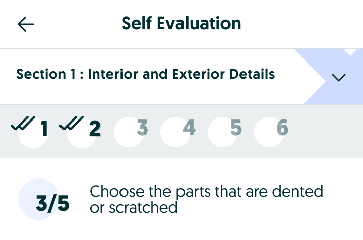
Option A
Both levels visible
Section title, numbered step circles, and a question count on the same screen.
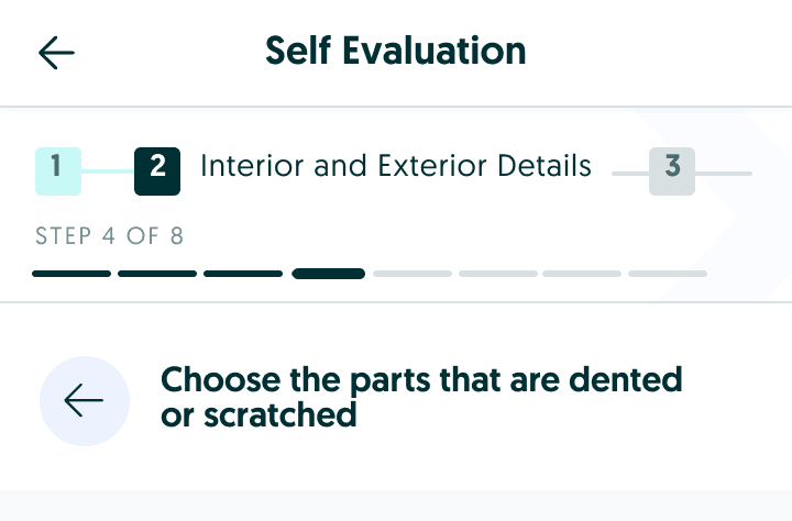
Option B
Section rail + step bar
A numbered section rail up top, with a segmented step bar underneath.
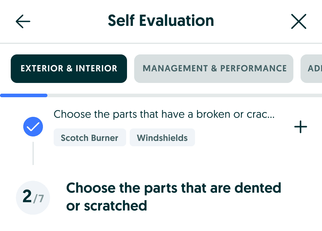
Option C
Tabs + question timeline
Section tabs stay put. Answered questions stack in a vertical timeline.
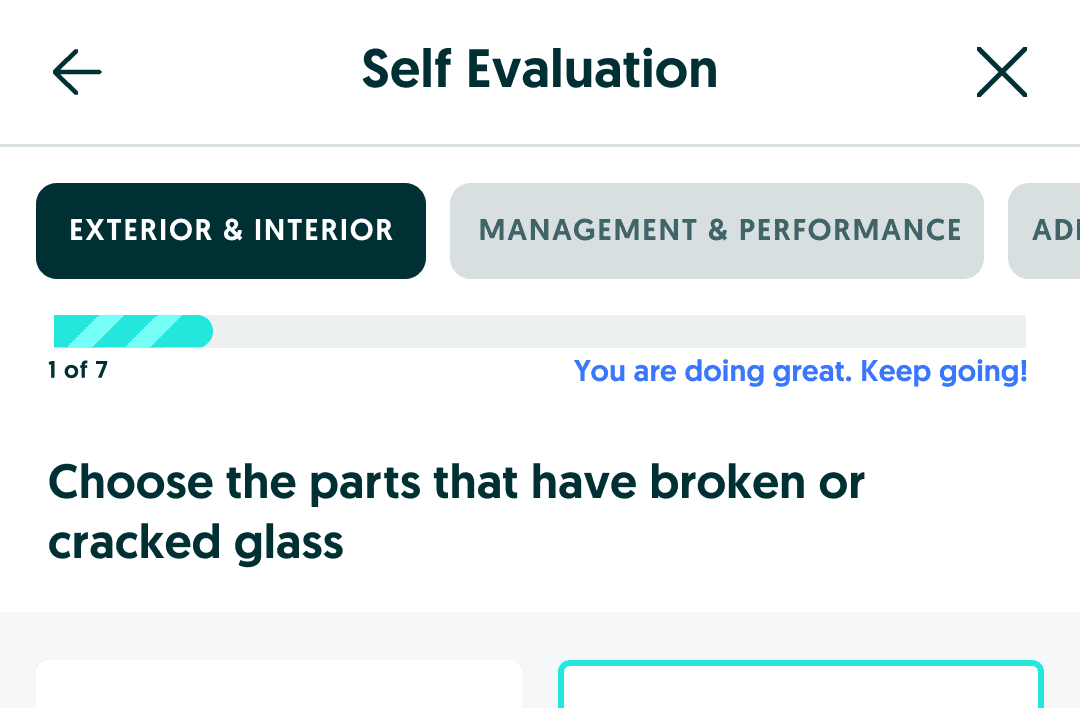
Option D
Progress + keep-going nudge
A loud progress bar paired with mid-flow encouragement to finish the chunk.
We kept the clearest combo: section visibility when it helps orientation, question progress that never disappears, plus timers and resume so leaving does not mean starting over.
Help in the moment
Same evaluation mindset for assistance: show where the answer lives, and show why a fact moves the quote, not jargon alone.
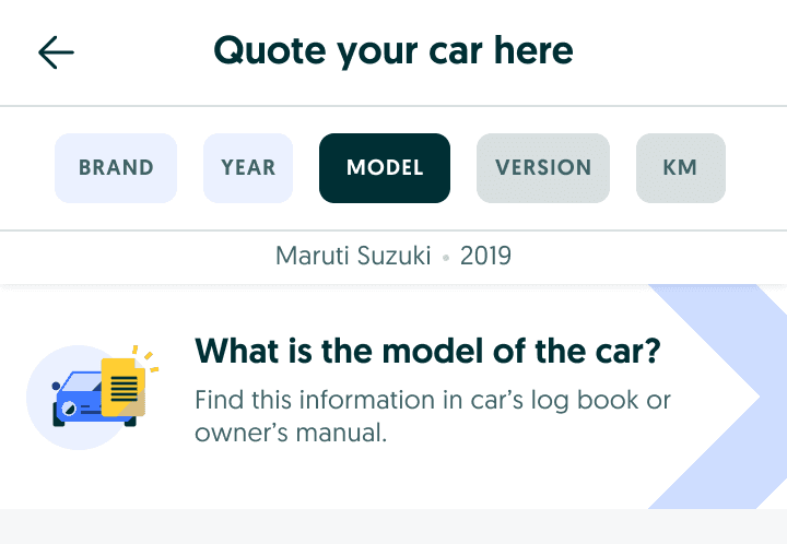
Cue A
Where to look
Illustrations and hints for brand, model, version, and km.
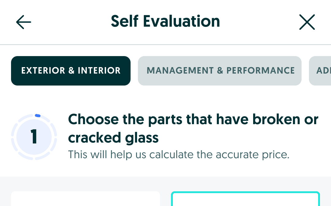
Cue B
Why it changes price
Condition questions that tie the fact to the quote in plain language.
Visual revamp and branding
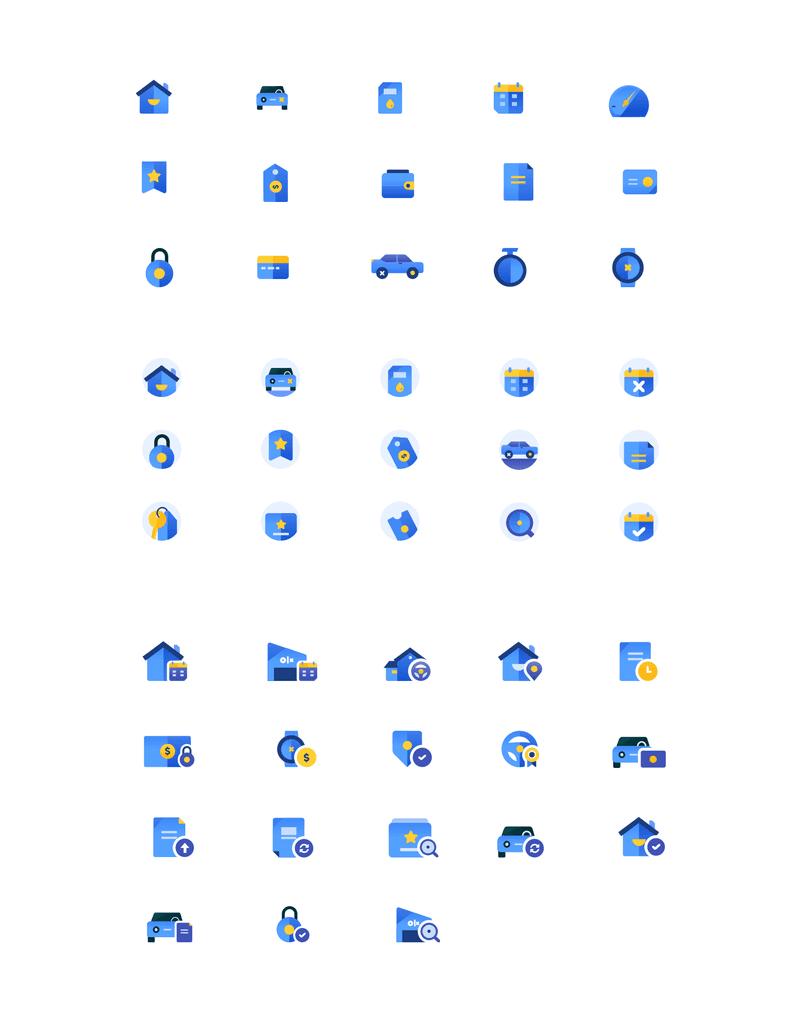
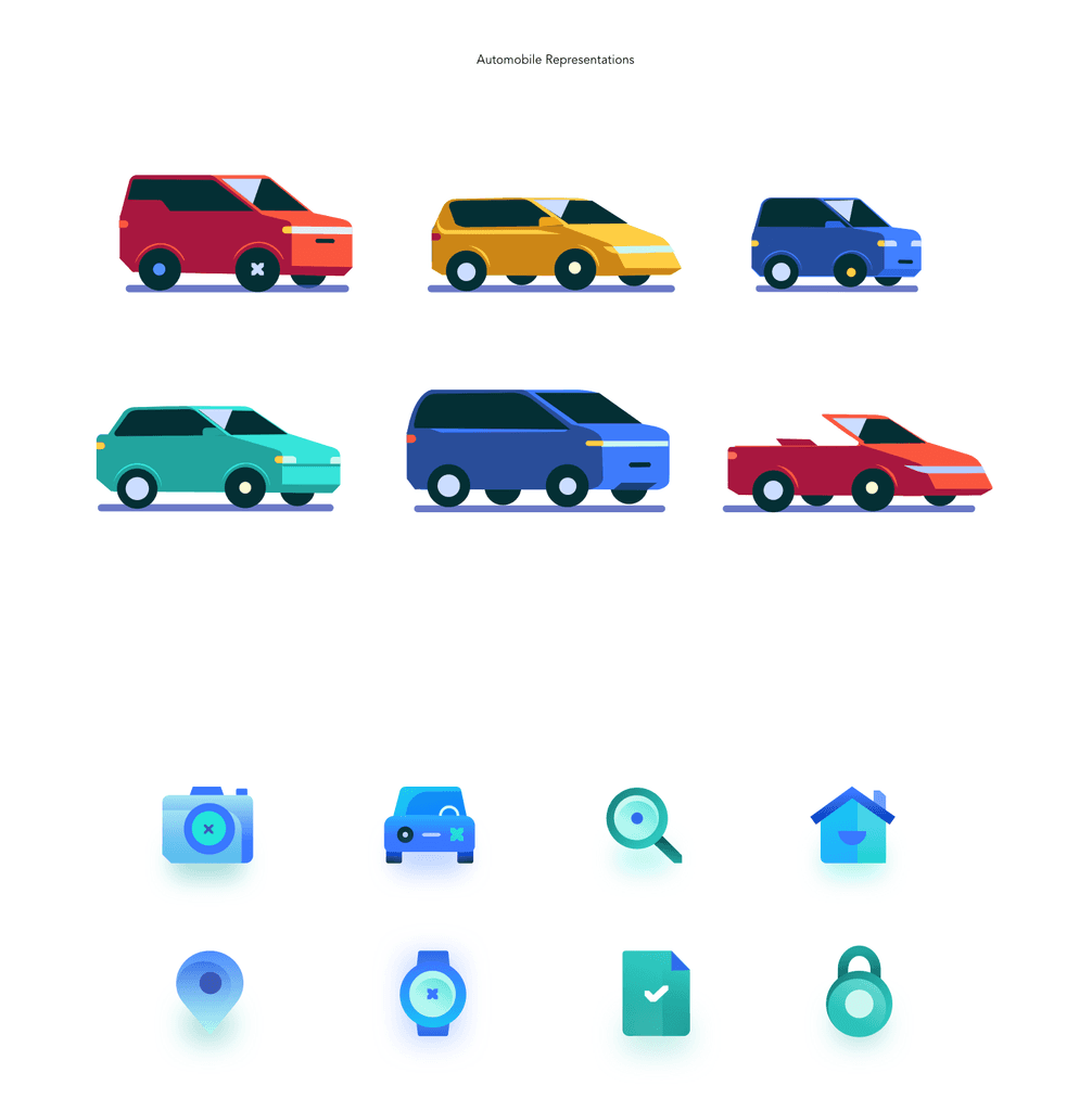
The launch needed more than a layout fix. We built a system of iconography, car illustrations, and cues that could carry basics, quote, self-eval, and booking without feeling like the old web.
What we shipped
The final path is one continuous sell journey: car basics, a quote that explains itself, then either finish online or book a visit, with room to leave and come back.
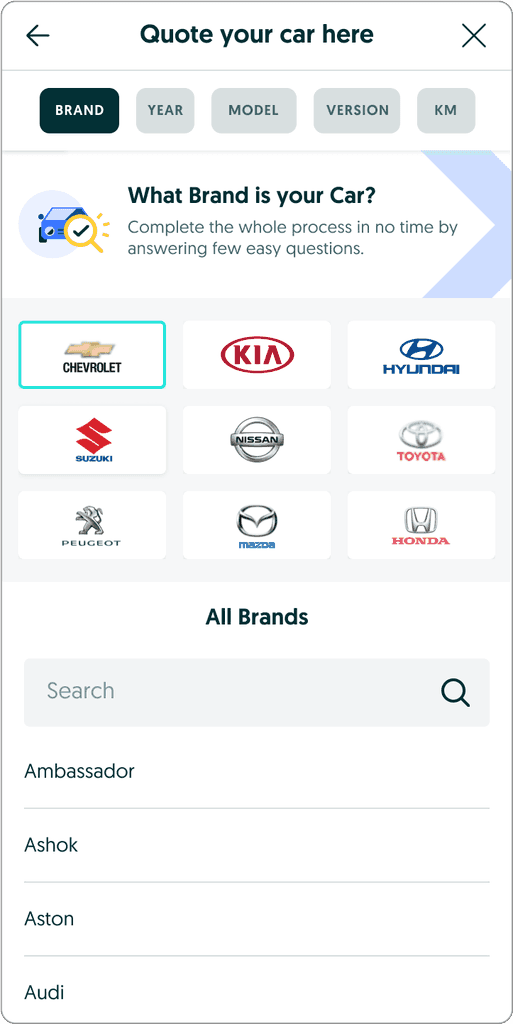
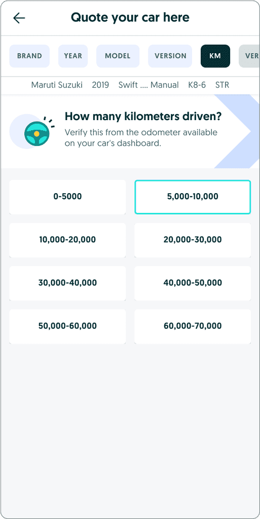
1. Car basics, one tap at a time
Brand, year, model, version, and km each get their own card. Top tabs keep the whole set visible so going back to edit is obvious. Sellers can also start from a plate number.

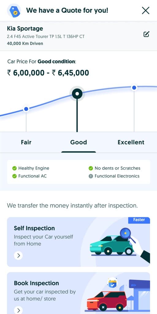
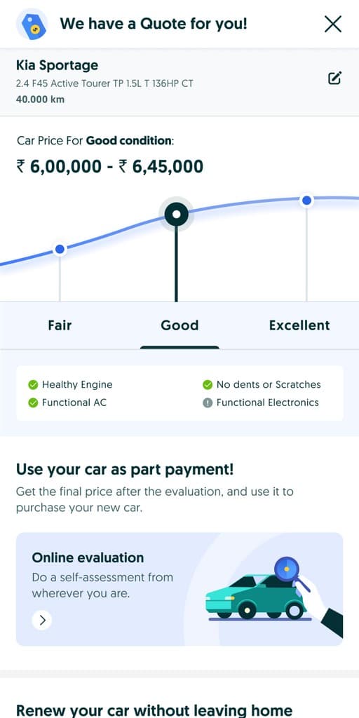
2. A quote that shows why the number moves
Fair, Good, and Excellent sit on the price itself. Sellers see how condition changes the range before they choose self-evaluation or a physical inspection.
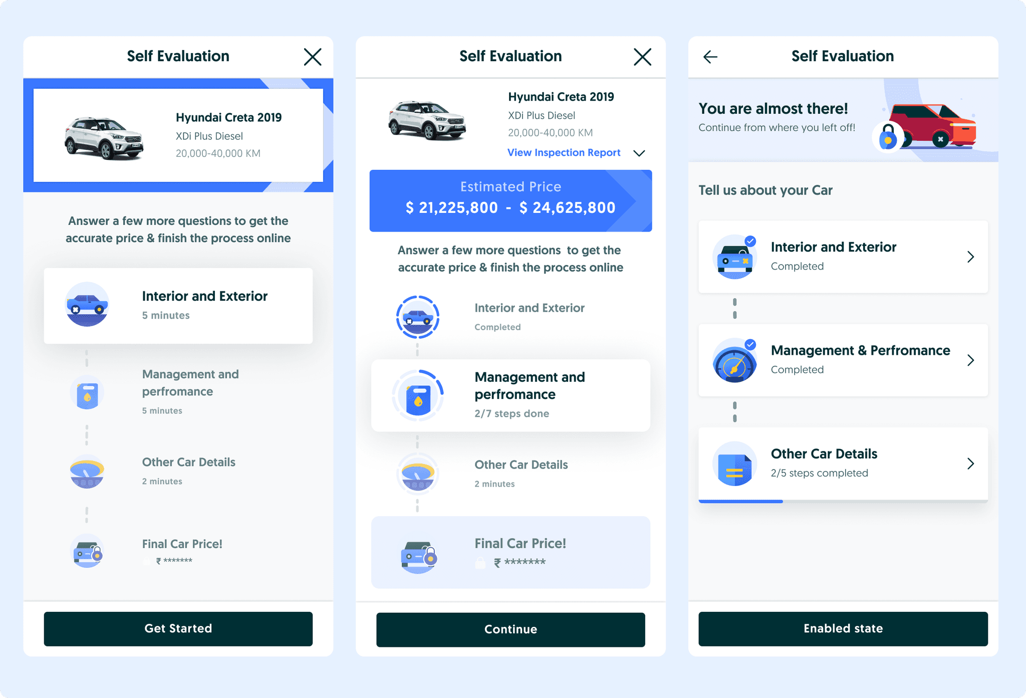
3. Self-evaluation you can leave
The long questionnaire breaks into timed sections with assistance and encouragement. Intermediate screens let people return mid-flow instead of restarting.
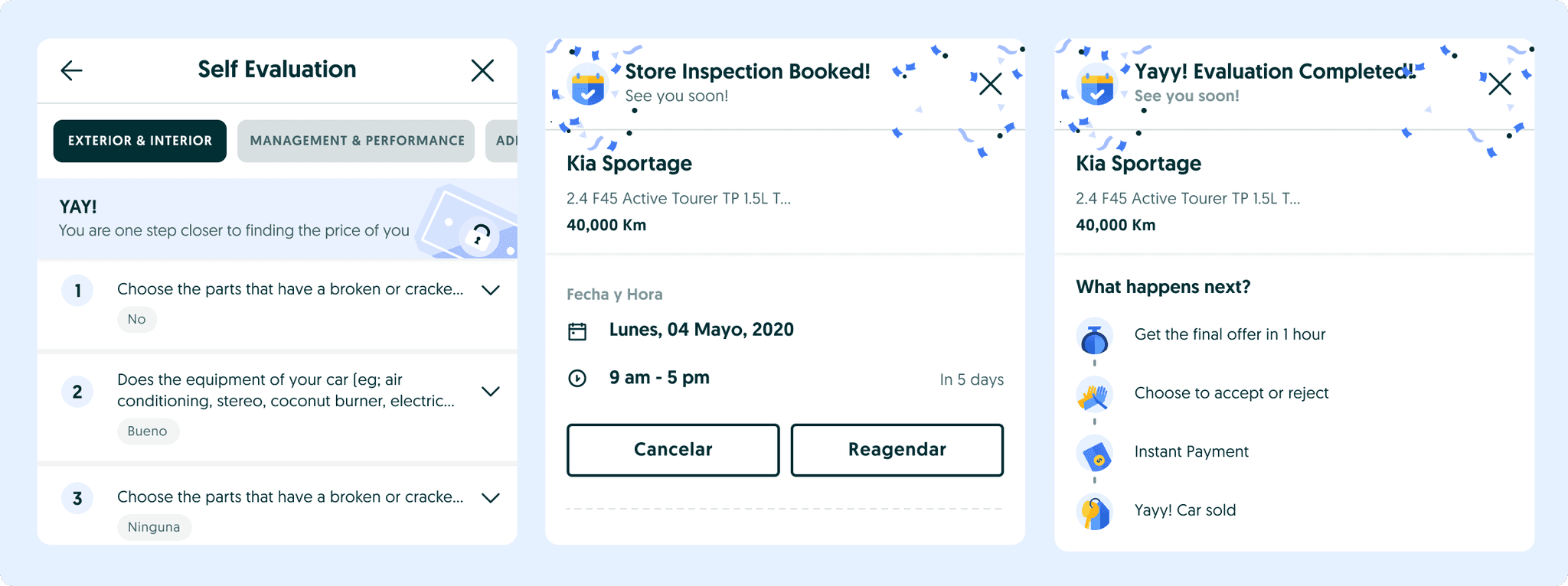
4. Booking and clear next steps
People who skip the online path book a store or home inspection. Either path ends with confirmation, small wins along the way, and a short “what happens next.”
Outcome
The revamped seller experience launched in Mexico and Chile in September 2022 as an app journey on the new system, not a squeezed website. It kept evolving as sellers and ops pushed back after ship.
- 2Markets launched
- Sep 2022First ship
- 1Shared design system
- Basics, quote, self-eval, and inspection booking share one visual language.
- Sellers can see why the quote moves, leave mid-flow, and still know what happens next.
- Design, product, eng, research, and ops shipped it together, then kept iterating.